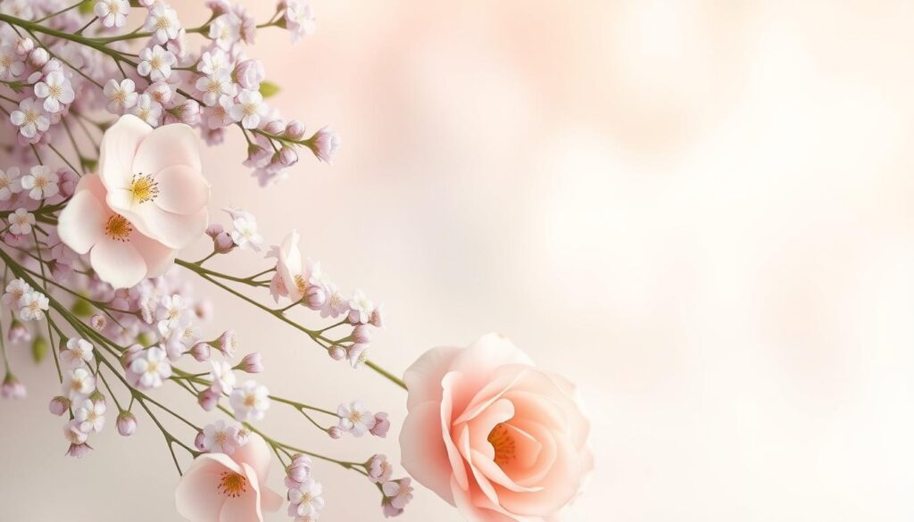
Get ready to dive into the magical world of pastel colors. We’ll look at how lavender, mint, and peach work together. These soft colors make a perfect palette for any room. They’re great for creating a calm space or adding a gentle touch to your decor.
Key Takeaways
- Discover the timeless appeal of pastel color schemes and their psychological impact on the senses.
- Understand the historical significance of pastel palettes and how they have evolved in modern design.
- Learn techniques for creating a soft and serene atmosphere with the perfect balance of lavender, mint, and peach tones.
- Explore seasonal adaptations of pastel color schemes and how to successfully incorporate them into your home decor.
- Discover the art of mixing pastels with neutral tones to achieve visual harmony and depth.
Understanding the Timeless Appeal of Pastel Color Schemes
Pastel colors have always been popular because of their calming effects and rich history. These soft colors bring peace and balance to our surroundings. Hues like lavender, mint, and peach make us feel relaxed and at ease in our homes.
The Psychology Behind Pastel Colors
Pastel colors help us relax and lower stress. They remind us of nature and are often seen as feminine. Lavender, for instance, can calm our minds and help us sleep better. Mint green boosts our focus, and peach tones bring warmth and comfort.
Historical Significance in Design
Pastel colors have been a design favorite since the 18th century. They were used in Rococo and Neoclassical styles to add elegance. Today, they’re a key part of many design styles, from Art Deco to Mid-Century Modern.
Modern Interpretations of Pastel Palettes
In today’s design, pastel colors are back in style. They create a calm and sophisticated look, fitting well with modern decor. Whether it’s soft lavender walls, mint accents, or peach textiles, pastel colors offer a fresh and inviting choice.
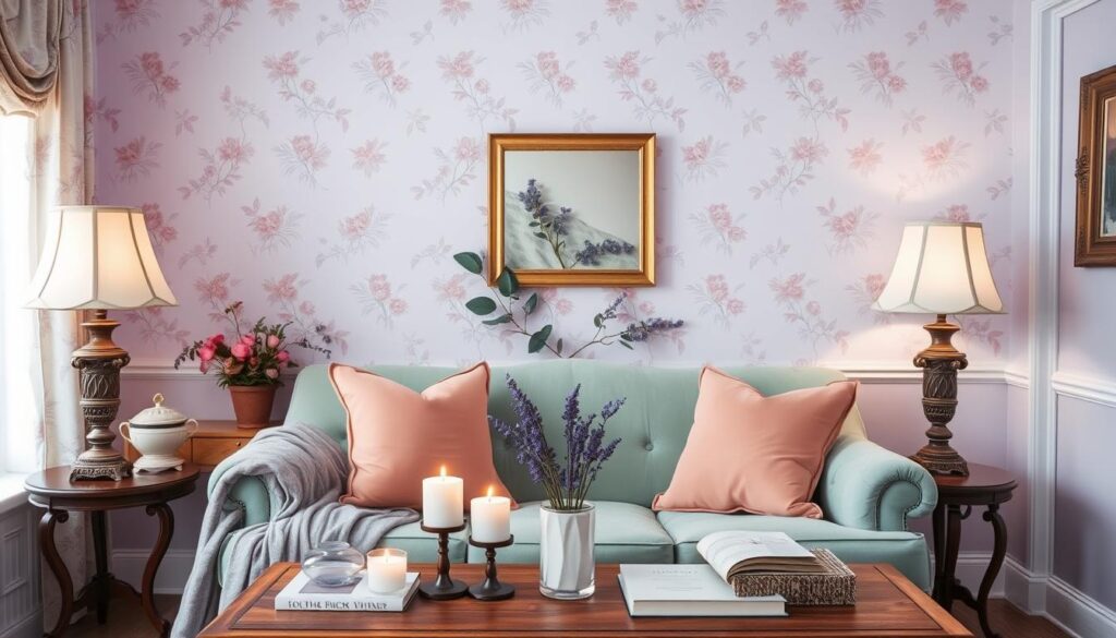
The Perfect Harmony of Lavender, Mint, and Peach Tones
Creating a beautiful interior needs careful color choices. Lavender, mint, and peach tones together bring peace and style. They make any room feel calm and welcoming.
Lavender’s softness matches mint’s coolness, making a space feel fresh and calm. Peach adds warmth, blending well with lavender and mint. This mix creates a perfect color balance.
These pastel colors can change any room into a peaceful place. By using these colors, you can make a design that looks great and feels soothing.
| Color | Characteristics | Complementary Colors |
|---|---|---|
| Lavender | Soft, calming, and soothing | Mint, peach, and gray |
| Mint | Fresh, rejuvenating, and cool | Lavender, peach, and white |
| Peach | Warm, inviting, and comforting | Lavender, mint, and beige |
Knowing how these pastel colors work together helps designers and homeowners. It lets them make spaces that are both beautiful and peaceful. Try out different pastel combinations and see what you can create.
“Pastel colors have a way of softening a space, creating a serene and calming atmosphere that invites you to relax and unwind.”
Creating a Soft and Serene Atmosphere with Pastels
Making a peaceful, calm space is key to pastel colors. Interior designers use smart lighting and texture mixes to achieve this. These methods help create a soft, serene feel in pastel rooms.
Light Management Techniques
Soft lighting brings out the calming side of pastels. Use dimmers, sconces, and floor lamps for a warm glow. Avoid harsh overhead lights. Adding candles can also make the room feel more peaceful, with their soft, dancing light.
Texture Combinations
Mixing different textured decor adds comfort and coziness to pastel rooms. Think plush throw pillows, woven baskets, and velvet curtains. This mix of soft textures makes the space interesting to look at and touch, adding to the calm vibe.
Space Planning with Pastels
- Plan the pastel room layout to make it feel open and easy to move through.
- Choose calming, symmetrical design to keep the space balanced and peaceful.
- Make the most of natural light to highlight the softness of pastel colors.
By carefully using these methods, you can make a space that feels calm and serene. It truly shows off the beauty of pastel design.
Incorporating Lavender: From Walls to Accessories
Lavender is a soothing and versatile color that can change any room. It brings calmness and elegance to any space. You can use it in many ways, from bold walls to small decorative items.
Using lavender on your walls can make a big impact. Choose a bold lavender or a soft lilac. Then, add white trim and natural wood for a peaceful look.
Lavender can also be used in decorative items. Add plush pillows, soft throws, and ceramics in purple to your room. These items add depth and make the space feel calm.
Lavender in the Details
For a full lavender experience, focus on the small things. Use lavender stems, candles, or even scented linens. These details can make your home feel like a peaceful oasis.
| Lavender Decor Element | Benefits |
|---|---|
| Lavender Accent Wall | Creates a focal point and sets the tone for the room |
| Lavender Textiles | Adds softness and texture to the space |
| Lavender Accents | Enhances the overall calming interiors aesthetic |
Using lavender in your home can make it feel calm and elegant. It can change any space into a peaceful place. From walls to small items, lavender can make your home a relaxing retreat.
Mint Green: Adding Fresh and Natural Elements
Mint green brings a refreshing vibe to your home. It’s a cool, soothing color that reminds us of lush mint green interiors and nature-inspired design. It’s perfect for making your living spaces calm and rejuvenating.
Botanical Inspiration
Get inspired by nature and add mint green accents to your home. Think of leafy plants, fragrant herbs, and serene landscapes. Mint green can make your home feel like a natural oasis.
- Try a mint green accent wall or use it as a backdrop for botanical art.
- Add mint green throw pillows, curtains, or rugs for a natural touch.
- Display plants, flowers, or herbs in mint green planters for a cohesive look.
Mint as an Accent Color
Mint green is bold on its own but also great as a green accents. It adds a fresh, modern touch when used sparingly.
- Pair mint green with white, gray, or neutrals for a calm look.
- Match mint green with coral, yellow, or blue for a lively vibe.
- Use mint green in small decor items like vases or candleholders for a natural touch.
Embracing mint green’s calming, nature-inspired qualities can make your spaces welcoming and refreshing. It brings the outdoors in beautifully.
Peach Tones: Bringing Warmth and Comfort
Peach tones are a captivating choice for interior design. They bring warmth and invite anyone into a space. This color can make a room cozy and comfortable, pleasing both homeowners and guests.
Using a peach color scheme can make a room feel serene and tranquil. Its warmth balances cool pastels like lavender or mint. This creates a beautiful and cozy warm interiors design.
Peach tones are also great for creating cozy design elements. They can be used in plush textiles and subtle accents. This adds a cozy feel that grabs your attention right away.
“Peach tones have a way of making a room feel like a warm embrace, inviting you to sink in and savor the moment.”
Using peach on walls, in furniture, or through accessories can change any space. It makes the room inviting and harmonious. By mixing peach with other colors, you can create a stunning and warm interior.

Pastel Perfection: Lavender, Mint, and Peach for a Soft, Sweet Look
Creating the perfect pastel mix can turn a room into a peaceful oasis. Lavender, mint, and peach soft tones blend beautifully. They bring a calm and cozy feel to any space.
Color Balance Techniques
Getting the pastel colors right is all about balance. Try mixing lavender, mint, and peach in different ways. This helps you find a look that feels just right for you and your room.
Use color blocking, gradients, or accents to make your design pop. This way, you get a look that’s both striking and unified.
Pattern Integration
Adding pastel patterns can make your space more interesting. Try using stripes, flowers, or shapes to add texture. Make sure these patterns match the pastel colors well.
This way, you get a design that’s not only pretty but also harmonious.
“The beauty of pastel colors lies in their ability to evoke a sense of calm and tranquility, while still adding visual interest and depth to a space.”
With the right color balancing and pattern integration, your space can become a pastel paradise. Lavender, mint, and peach will make it a cozy and welcoming place.
Seasonal Adaptations of Pastel Color Schemes
Pastel colors are timeless and versatile. They can change with the seasons. By adding seasonal decor and trends, your design stays fresh all year.
To adapt pastels for each season, mix soft tones with bold accents. In spring, pair lavender and mint with floral patterns or citrus. Summer brings lighter fabrics and airy textures for a beachy feel. Autumn adds earthy neutrals and warm metallics for a cozy vibe.
In winter, pastels work with metallics, faux fur, and holiday items. This makes your space feel intentional and seasonal.
Learning about pastel trends and adaptable design lets you enjoy pastel colors all year. A few tweaks keep your space looking great with every season.
“Pastel color schemes are the chameleons of interior design – they can transform to complement any season.”
Mixing Pastels with Neutrals for Balance
Blending pastel colors with neutral tones is a game-changer for interior design. By picking complementary neutrals and using color layering, you get a balanced and sophisticated look. This will make your interior design stand out.
Selecting Complementary Neutrals
Choosing the right neutral colors is key for a great pastel and neutral palette. White, beige, and gray are classic choices that let pastel colors shine. Try different shades to find the perfect mix that highlights your pastel accents.
Creating Depth with Color Layering
Color layering adds depth and interest to your balanced interiors. Start with neutral tones as a base. Then, add pastel shades through accessories, textiles, and furniture. This approach creates a welcoming and harmonious space.
| Neutral Colors | Pastel Shades |
|---|---|
| White | Lavender |
| Beige | Mint Green |
| Gray | Peach |
Using the right mix of neutral colors and pastel tones makes for a timeless and stunning interior. It brings a sense of calm and elegance. Show off your color layering skills and turn your space into a serene balanced interior haven.
Maintaining and Refreshing Your Pastel Space
Keeping your pastel-inspired interior looking great needs a careful plan for interior maintenance, color refresh, and lasting design. With a few smart steps, your pastel paradise can stay bright and stylish for many years.
Regular cleaning and simple upkeep are crucial. Dust gently, vacuum, and clean walls to avoid dulling the soft colors. Use mild, pH-neutral cleaners to protect your pastel colors.
For color refresh, watch for fading or wear on walls. Touch up or repaint high-traffic spots to revive your space. Update accessories like throw pillows or artwork for a fresh look.
To make your pastel space last, choose durable furniture and fabrics. Pick items that stand the test of time. Also, protect colors from fading by using UV-blocking window treatments or placing furniture wisely to avoid direct sunlight.
“Maintaining the beauty of a pastel-inspired space is all about finding the right balance between preservation and refreshment.”
By following these easy yet effective tips, your pastel space will stay lively, fresh, and timeless for years.
Common Mistakes to Avoid When Decorating with Pastels
Decorating with pastel colors is an art that needs balance for a soft, serene look. Even experienced designers can make design mistakes and pastel pitfalls. We’ll share interior design tips to help you avoid these and create a beautiful pastel space.
Avoiding Color Imbalance
One big design mistake with pastels is not getting the color balance right. Using just one pastel can make a room look unbalanced. Mixing too many pastels without a theme can make it look chaotic. The trick is to pick a few pastel colors that work well together.
Preventing Oversaturation
Another pastel pitfall is using too much of them. Pastels are soft, but too much can feel overwhelming. It’s important to mix pastels with neutral colors like white or gray to keep the space balanced.
Mastering Texture and Lighting
Good interior design with pastels also means knowing about texture and lighting. Smooth finishes make pastels look serene. Adding textures like plush fabrics adds depth. And, the right lighting can change how pastels look.
By avoiding these design mistakes and pastel pitfalls, you can make a space that’s both beautiful and peaceful. With the right interior design tips and attention to detail, your pastel space will be a calm and stylish retreat.
Conclusion
We’ve explored the beauty of lavender, mint, and peach colors in the pastel design world. These colors have a calming effect and a rich history. They can make any space feel soft, sweet, and peaceful.
Learning how to use these colors is easy. You can manage light, mix textures, and plan spaces well. This way, you can turn any room into a calm and inspiring place. You can pick one color to stand out, like lavender, or use them all for a complete look.
Keep exploring interior design and let pastel colors inspire you. Balance, patterns, and seasonal changes are key. With these, you can make your home a place of comfort, relaxation, and timeless beauty.
FAQ
What is the psychology behind using pastel colors in interior design?
Pastel colors calm and soothe the mind. They bring feelings of tranquility and softness. These hues create a serene atmosphere in any space.
How have pastel color schemes evolved throughout design history?
Pastel colors have been used for centuries, starting in the 18th century’s Rococo era. They’ve remained popular, adapting to different design movements. Now, they’re part of modern, classic palettes.
What are some modern ways to incorporate pastel colors into a space?
You can use pastel colors in many ways, like bold accent walls or delicate textiles. Mixing colors, textures, and lighting creates stunning, harmonious designs.
How can the combination of lavender, mint, and peach create a cohesive look?
Lavender, mint, and peach work well together. Lavender’s purple, mint’s green, and peach’s warmth create a soft, serene look.
What lighting techniques can enhance the calming effect of pastel colors?
Soft, diffused lighting is key for pastel colors. Floor lamps or dimmable fixtures highlight these hues, making the space cozy and inviting.
How can texture be used to complement pastel color schemes?
Mixing textures like plush fabrics and natural materials adds depth to pastel interiors. This balance creates a visually appealing space.
What are some effective ways to incorporate lavender into a design scheme?
Use lavender in various ways, like painting walls or adding decorative accessories. It can also be featured in textiles and artwork, or even natural elements.
How can mint green be used to add a fresh, natural feel to a space?
Mint green works well as a main color or a subtle accent. Adding plants or nature-inspired art brings a refreshing feel. It can also add a pop of freshness.
What are the benefits of using peach tones in interior design?
Peach tones add warmth and coziness. They’re great for living rooms and bedrooms, making them feel relaxing.
How can color balancing techniques be used when combining lavender, mint, and peach?
Balancing these colors requires careful planning. Use one color as the main shade and the others as accents. This creates a harmonious design.
How can pastel color schemes be adapted for different seasons?
Adjust pastel schemes for each season. For example, use warmer peach tones in fall or add mint accents in spring. This keeps the look fresh all year.
What are some effective ways to mix pastels with neutral colors?
Pair pastels with neutral tones like white or gray for a balanced look. Use neutrals as a base, letting pastels be the focus. Balance is key.
How can you maintain and refresh a pastel-inspired interior over time?
Refresh your space by updating paint, textiles, and accessories. Simple changes, like new throw pillows or artwork, can revitalize the look.
What are some common mistakes to avoid when decorating with pastels?
Avoid overusing pastels, creating a monochromatic look, or lacking contrast. Choose colors wisely and pay attention to scale and proportion for a successful design.